You have built something impressive. An AI tool that solves a real problem, saves time, or makes people’s work easier. But here is the hard truth. If your launch page does not clearly communicate that value within seconds, most visitors will leave without ever trying it.
A great AI tool launch page is not about flashy design or trendy animations. It is about clear messaging, trust, and giving visitors exactly what they need to say yes. This guide walks you through every section of a high-converting launch page, from the headline down to the final call to action.
Why Your AI Tool Launch Page Matters More Than You Think
Your launch page is often the first real interaction someone has with your product. Whether they arrive from a Product Hunt listing, a social media post, or a Google search, the page has roughly five seconds to earn their attention.
For AI tools specifically, the challenge is even bigger. Many potential users are skeptical about AI claims. They have seen too many tools promise “revolutionary” results and deliver something mediocre. Your page needs to overcome that skepticism fast.
As conversion expert Peep Laja once said, “Clarity trumps persuasion.” That principle applies to every element on your launch page.
The Hero Section: Your First and Most Important Impression
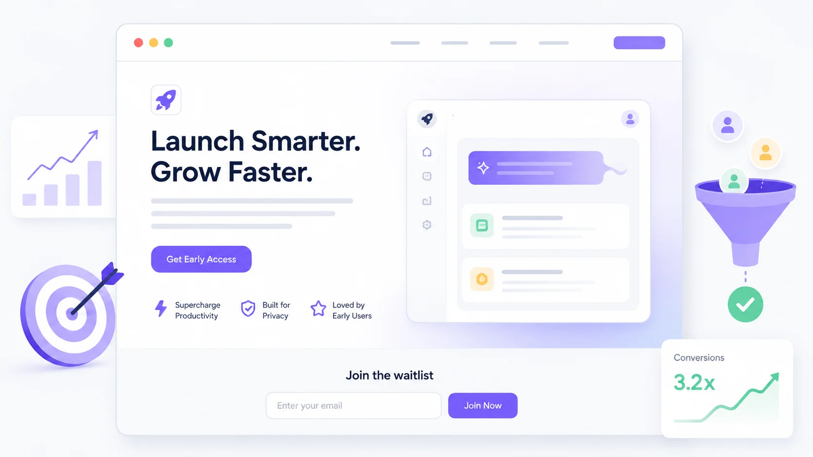
The hero section is the top portion of your page that visitors see without scrolling. It carries the heaviest weight in determining whether someone stays or bounces.
Write a Headline That States the Outcome
Your headline should answer one question: what does this tool do for me? Skip the clever wordplay and focus on the specific outcome your AI tool delivers.
Here is a comparison of weak versus strong headlines for AI tools:
| Weak Headline | Strong Headline | Why It Works |
|---|---|---|
| AI-Powered Writing Assistant | Write Blog Posts in 10 Minutes, Not 3 Hours | States a specific, measurable outcome |
| Next-Gen Data Analytics | Find Revenue Leaks in Your SaaS Without a Data Team | Names the audience and solves a pain point |
| Smart Email Tool | Reply to Customer Emails 5x Faster With AI Drafts | Quantifies the benefit clearly |
Notice that the strong headlines do not even mention “AI” as the main selling point. They lead with the result, not the technology.
Subheadline and Supporting Copy
Your subheadline should add one layer of context. Explain how the tool delivers the outcome promised in the headline. Keep it to one or two sentences maximum.
For example, if your headline is “Write Blog Posts in 10 Minutes,” your subheadline might say: “Our AI analyzes your topic, generates a structured draft, and matches your brand voice so you just review and publish.”
The Call to Action Button
Place a clear, prominent call to action button in the hero section. Use action-oriented text that tells visitors exactly what happens next.
- “Start Free Trial” works better than “Get Started”
- “Try It Free, No Card Required” removes friction
- “See It in Action” works well if you lead with a demo
- Avoid vague labels like “Learn More” or “Submit”
Show the Product, Do Not Just Describe It
AI tools are abstract by nature. People cannot picture what “AI-powered automation” looks like until you show them. This is where most launch pages fail.
Use a Product Demo or Walkthrough
A short video or interactive product demo is one of the most effective conversion tools you can add to your page. Keep it under 90 seconds and focus on showing one complete workflow from start to finish.
If video is not an option, use annotated screenshots or animated GIFs that walk visitors through the core experience. Show real outputs, not mockups.
Before and After Comparisons
Another powerful approach is showing the “before” (without your tool) and “after” (with your tool) side by side. This works especially well for AI tools that transform input into output, like image generators, writing assistants, or data analyzers.
The before-and-after format taps into something visitors already understand. They can see the gap between their current workflow and the better version your tool offers.
Build Trust With Social Proof and Credibility Signals
AI tools face a trust deficit that other software categories do not. People worry about accuracy, data privacy, and whether the tool actually works as advertised. Your launch page needs to address these concerns directly.
Types of Social Proof That Work
Not all social proof is created equal. Here is what carries the most weight on an AI tool launch page:
- Specific user testimonials with names, roles, and measurable results
- Logos of recognizable companies that use your tool
- Usage statistics like “50,000 documents processed” or “used by teams in 40 countries”
- Ratings and reviews from third-party platforms like G2, Product Hunt, or Capterra
- Media mentions or awards from recognized publications
If you are early stage and do not have big-name logos, that is fine. Even three genuine testimonials from beta users can make a significant difference in building trust with visitors.
Address AI-Specific Concerns
Add a small section or FAQ that directly tackles the questions AI tool users commonly have:
- How accurate is the AI output?
- Is my data used to train the model?
- Can I review and edit the AI’s work before it goes live?
- What happens if the AI makes a mistake?
Answering these proactively shows confidence in your product and removes hesitation before it becomes a reason to leave.
Structure the Features Section for Scanners
Most visitors will not read your page word by word. They scan. Your features section needs to accommodate that behavior while still communicating depth.
Lead Each Feature With a Benefit
Instead of listing technical capabilities, frame each feature as something the user gains. “Automatic data cleaning” becomes “Spend zero time fixing messy spreadsheets.” The feature is the same, but the framing speaks to what the user actually cares about.
A good format is a grid of three to six features, each with a short heading, one sentence of explanation, and an icon or small visual. Do not overload this section. Highlight only what matters most.
Use a Comparison Table for Competitive Positioning
If your AI tool competes in a crowded space, a comparison table can be incredibly effective. Show how your tool stacks up against alternatives or the manual way of doing things.
| Capability | Manual Process | Competitor Tools | Your AI Tool |
|---|---|---|---|
| Setup time | Days or weeks | Hours | Under 5 minutes |
| Accuracy | Varies by person | Moderate | 95%+ with human review |
| Cost | Full-time hire | $99 to $299/month | Free tier available |
| Learning curve | N/A | Moderate | No training needed |
Keep the comparison honest. Exaggerating claims in a comparison table destroys credibility faster than anything else on the page.
Pricing: Be Transparent and Remove Guesswork
If your tool has a free tier or trial, make that obvious. If pricing is usage-based, explain what that means in plain language. Hidden pricing is one of the biggest conversion killers for AI tools.
You do not need to show a full pricing grid on your launch page if it is complex. But you should at minimum answer: “Can I try this for free?” and “What does it cost when I am ready to pay?”
Many successful AI tools use a “Start Free, Upgrade When Ready” approach that lowers the barrier to entry. If that fits your model, make the free option the most prominent element in your pricing section.
The Bottom of the Page: Your Final Conversion Opportunity
Visitors who scroll to the bottom of your page are your most interested prospects. They have read through your features, seen your social proof, and are now making a decision. Give them what they need to act.
Repeat the Call to Action
Place another call to action button at the bottom with the same clear, action-oriented text from your hero section. Many launch pages make the mistake of having only one CTA at the top, forcing interested visitors to scroll all the way back up.
Add a Final Reassurance
A short line of text near the bottom CTA can address last-minute hesitation. Something like “No credit card required,” “Cancel anytime,” or “Your data stays private” can be the nudge that turns a maybe into a yes.
Common Launch Page Mistakes to Avoid
Even well-designed pages can underperform because of avoidable errors. Here are the ones that hurt AI tool conversions the most:
- Leading with the technology instead of the outcome (nobody buys “GPT-4 integration,” they buy time savings)
- Using too much jargon like “neural networks” or “transformer architecture” when your audience is non-technical
- Burying the call to action below the fold or hiding it behind multiple navigation steps
- Not having a mobile-optimized version (over half of Product Hunt traffic comes from mobile)
- Slow page load times from unoptimized images or heavy scripts
- Missing basic SEO elements like meta descriptions, heading structure, and page titles
As marketing strategist April Dunford explains, “Positioning is the foundation of all marketing.” If your launch page positioning is off, no amount of design polish will save it.
Optimizing Your Launch Page After It Goes Live
Your first version is a starting point, not a finished product. Once you start getting traffic, pay attention to how visitors interact with your page.
Track the Right Metrics
- Bounce rate tells you if the hero section is working
- Scroll depth shows where visitors lose interest
- CTA click-through rate measures how compelling your offer is
- Sign-up completion rate reveals friction in the conversion flow
Test One Element at a Time
A/B test your headline, CTA text, and hero image individually. Changing too many elements at once makes it impossible to know what actually moved the needle.
Many AI founders find that small copy changes on the launch page produce bigger improvements than visual redesigns. Start with your headline and CTA button text before rethinking the layout.
Launch Page Checklist for AI Tools
Before you go live, walk through this checklist to make sure every essential element is in place:
- Hero section with outcome-focused headline and clear CTA
- Product demo, video, or annotated screenshots
- At least three testimonials or credibility signals
- Features section framed as user benefits
- Pricing transparency or free trial information
- FAQ addressing AI-specific concerns
- Mobile responsiveness tested on multiple devices
- Page load time under three seconds
- Analytics and conversion tracking installed
- Bottom-of-page CTA with reassurance copy
Use this list as your quality gate. If any item is missing, fix it before driving traffic to the page. Every gap is a potential leak in your conversion funnel.
Once your page is live, do not forget to promote your tool across multiple channels. List it on AI tool directories, invest in content marketing, and make sure your branding is consistent everywhere your product appears.
Conclusion
Writing an AI tool launch page that converts comes down to clarity, proof, and making it ridiculously easy for visitors to take the next step. Lead with the outcome your tool delivers, show it working in the real world, back it up with genuine social proof, and remove every possible point of friction between your visitor and the sign-up button. The tools and tactics in this guide give you a proven framework, but the real advantage comes from knowing your audience well enough to speak directly to what they need.